DgsCreateRadioButton
Jump to navigation
Jump to search
This function creates a radio button.
Syntax
element dgsCreateRadioButton ( float x, float y, float width, float height, string text, bool relative [, element parent = nil, int textcolor, float scaleX = 1.0, float scaleY = 1.0, element normalUncheckedImage = nil, element hoveringUncheckedImage = nil, element clickedUnCheckedImage = nil, int normalUnCheckedColor = 0xFFFFFFFF, int hoveringUnCheckedColor = 0xFFFFFFFF, int clickedUnCheckedColor = 0xFFB4B4B4, element normalCheckedImage = nil, element hoveringCheckedImage = nil, element clickedCheckedImage = nil, int normalCheckedColor = 0xFFFFFFFF, int hoveringCheckedColor = 0xFFFFFFFF,int clickedCheckedColor = 0xFFB4B4B4 ] )
Required Arguments

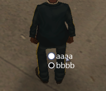
Example Dx radio buttons.
- x: A float of the 2D x position of the radio button on a player's screen. This is affected by the relative argument.
- y: A float of the 2D y position of the radio button on a player's screen. This is affected by the relative argument.
- width: A float of the width of the text field next to the radio button. This is affected by the relative argument.
- height: A float of the height of the text field next to the radio button. This is affected by the relative argument.
- text: The text to be displayed next to the radio button.
- relative: This is whether sizes and positioning are relative. If this is true, then all x,y,width,height floats must be between 0 and 1, representing measures relative to the parent.
Optional Arguments
NOTE: When using optional arguments, you might need to supply all arguments before the one you wish to use. For more information on optional arguments, see optional arguments.
- parent: This is the parent that the DGS radio button is attached to. If the relative argument is true, sizes and positioning will be made relative to this parent. If the relative argument is false, positioning will be the number of offset pixels from the parent's origin. If no parent is passed, the parent will become the screen - causing positioning and sizing according to screen positioning.
- textcolor: An int of the color of the radio button.
- scaleX : A float of the width of the text scale.
- scaleY: A float of the height of the text scale.
- normalUncheckedImage: A material element of the default state of the radio button. (unselected)
- hoveringUncheckedImage: A material element of the hovered state of the radio button. (unselected)
- clickedUnCheckedImage: A material element of the clicked state of the radio button. (unselected)
- normalUnCheckedColor: An integer of the color of the default state of the radio button. (unselected)
- hoveringUnCheckedColor: An integer of the color of the hovered state of the radio button. (unselected)
- clickedUnCheckedColor: An integer of the color of the clicked state of the radio button. (unselected)
- normalCheckedImage: A material element of the default state of the radio button. (selected)
- hoveringCheckedImage: A material element of the hovered state of the radio button. (selected)
- clickedCheckedImage: A material element of the clicked state of the radio button. (selected)
- normalCheckedColor: An integer of the color of the default state of the radio button. (selected)
- hoveringCheckedColor: An integer of the color of the hovered state of the radio button. (selected)
- clickedCheckedColor: An integer of the color of the clicked state of the radio button. (selected)
Example
Click to collapse [-]
ClientExample 1:
DGS = exports.dgs
showCursor(true)
local rb1 = DGS:dgsCreateRadioButton(500,500,200,30,"aaaa",false)
local rb2 = DGS:dgsCreateRadioButton(500,520,200,30,"bbbb",false)
See Also
- dgsGetPosition
- dgsSetPosition
- dgsSetParent
- dgsGetParent
- dgsGetChild
- dgsGetChildren
- dgsGetSize
- dgsSetSize
- dgsGetType
- dgsSetLayer
- dgsGetLayer
- dgsSetCurrentLayerIndex
- dgsGetCurrentLayerIndex
- dgsGetLayerElements
- dgsGetProperty
- dgsSetProperty
- dgsSetPropertyInherit
- dgsGetProperties
- dgsSetProperties
- dgsGetVisible
- dgsSetVisible
- dgsGetEnabled
- dgsSetEnabled
- dgsGetPositionAlignment
- dgsSetPositionAlignment
- dgsGetAlpha
- dgsSetAlpha
- dgsGetFont
- dgsSetFont
- dgsGetText
- dgsSetText
- dgsGetPostGUI
- dgsSetPostGUI
- dgsGetInputEnabled
- dgsSetInputEnabled
- dgsGetInputMode
- dgsSetInputMode
- dgsAttachToAutoDestroy
- dgsDetachFromAutoDestroy
- dgsFocus
- dgsBlur
- dgsCreateFont
- dgsBringToFront
- dgsMoveToBack
- dgsGetScreenSize
- dgsGetCursorPosition
- dgsGetMouseEnterGUI
- dgsGetMouseLeaveGUI
- dgsIsMouseWithinGUI
- dgsSetSystemFont
- dgsGetSystemFont
- dgsGetElementsInLayer
- dgsGetElementsFromResource
- dgsGetFocusedGUI
- dgsImportFunction
- dgsImportOOPClass
- dgsG2DLoadHooker
- dgsSetRenderSetting
- dgsGetRenderSetting
- dgsSimulateClick
- dgsGetRootElement
- dgsAddMoveHandler
- dgsRemoveMoveHandler
- dgsIsMoveHandled
- dgsAddSizeHandler
- dgsRemoveSizeHandler
- dgsIsSizeHandled
- dgsAttachElements
- dgsDetachElements
- dgsElementIsAttached
- dgsAddPropertyListener
- dgsRemovePropertyListener
- dgsGetListenedProperties
- dgsSetMultiClickInterval
- dgsGetMultiClickInterval
- dgsSetMouseStayDelay
- dgsGetMouseStayDelay
- dgsCenterElement
- dgsSetElementKeeperEnabled
- dgsGetElementKeeperEnabled
- dgsSetClickingSound
- dgsGetClickingSound
- dgsSetClickingSoundVolume
- dgsGetClickingSoundVolume
Custom Cursor Functions
- dgsSetCustomCursorEnabled
- dgsGetCustomCursorEnabled
- dgsSetCustomCursorImage
- dgsGetCustomCursorImage
- dgsSetCustomCursorSize
- dgsGetCustomCursorSize
- dgsGetCustomCursorType
- dgsSetCustomCursorColor
- dgsGetCustomCursorColor
Multi Language Supports
- dgsTranslationTableExists
- dgsSetTranslationTable
- dgsAttachToTranslation
- dgsDetachFromTranslation
- dgsSetAttachTranslation
- dgsGetTranslationName
- dgsTranslationAddPropertyListener
- dgsTranslationRemovePropertyListener
Animation
- dgsAnimTo
- dgsIsAniming
- dgsStopAniming
- dgsMoveTo
- dgsIsMoving
- dgsStopMoving
- dgsSizeTo
- dgsIsSizing
- dgsStopSizing
- dgsAlphaTo
- dgsIsAlphaing
- dgsStopAlphaing
- dgsAddEasingFunction
- dgsRemoveEasingFunction
- dgsEasingFunctionExists
3D Element
- dgs3DGetPosition
- dgs3DSetPosition
- dgs3DGetInterior
- dgs3DSetInterior
- dgs3DSetDimension
- dgs3DGetDimension
3D Interface
- dgsCreate3DInterface
- dgs3DInterfaceProcessLineOfSight
- dgs3DInterfaceGetBlendMode
- dgs3DInterfaceSetBlendMode
- dgs3DInterfaceGetDoublesided
- dgs3DInterfaceSetDoublesided
- dgs3DInterfaceGetFaceTo
- dgs3DInterfaceSetFaceTo
- dgs3DInterfaceGetResolution
- dgs3DInterfaceSetResolution
- dgs3DInterfaceSetRoll
- dgs3DInterfaceGetRoll
- dgs3DInterfaceGetSize
- dgs3DInterfaceSetSize
- dgs3DInterfaceIsAttached
- dgs3DInterfaceAttachToElement
- dgs3DInterfaceDetachFromElement
- dgs3DInterfaceSetAttachedOffsets
- dgs3DInterfaceGetAttachedOffsets
3D Line
- dgsCreate3DLine
- dgs3DLineSetLineType
- dgs3DLineGetLineType
- dgs3DLineAddItem
- dgs3DLineRemoveItem
- dgs3DLineSetItemPosition
- dgs3DLineGetItemPosition
- dgs3DLineSetItemWidth
- dgs3DLineGetItemWidth
- dgs3DLineSetItemColor
- dgs3DLineGetItemColor
- dgs3DLineAttachToElement
- dgs3DLineIsAttached
- dgs3DLineDetachFromElement
- dgs3DLineSetAttachedOffsets
- dgs3DLineGetAttachedOffsets
- dgs3DLineSetRotation
- dgs3DLineGetRotation
3D Image
- dgsCreate3DImage
- dgs3DImageSetSize
- dgs3DImageGetSize
- dgs3DImageSetImage
- dgs3DImageGetImage
- dgs3DImageAttachToElement
- dgs3DImageIsAttached
- dgs3DImageDetachFromElement
- dgs3DImageSetAttachedOffsets
- dgs3DImageGetAttachedOffsets
- dgs3DImageGetNativeSize
- dgs3DImageSetUVPosition
- dgs3DImageGetUVPosition
- dgs3DImageSetUVSize
- dgs3DImageGetUVSize
3D Text
- dgsCreate3DText
- dgs3DTextIsAttached
- dgs3DTextAttachToElement
- dgs3DTextDetachFromElement
- dgs3DTextSetAttachedOffsets
- dgs3DTextGetAttachedOffsets
Browser
Button
- dgsCreateButton
- dgsButtonGetTextExtent
- dgsButtonGetFontHeight
- dgsButtonGetTextSize
- dgsButtonMakeForm
- dgsButtonRemoveForm
Check Box
- dgsCreateCheckBox
- dgsCheckBoxGetSelected
- dgsCheckBoxSetSelected
- dgsCheckBoxSetHorizontalAlign
- dgsCheckBoxGetHorizontalAlign
- dgsCheckBoxSetVerticalAlign
- dgsCheckBoxGetVerticalAlign
- dgsCheckBoxGetButtonSide
- dgsCheckBoxSetButtonSide
- dgsCheckBoxGetButtonAlign
- dgsCheckBoxSetButtonAlign
Combo Box
- dgsCreateComboBox
- dgsComboBoxAddItem
- dgsComboBoxRemoveItem
- dgsComboBoxSetItemText
- dgsComboBoxGetItemText
- dgsComboBoxSetItemData
- dgsComboBoxGetItemData
- dgsComboBoxGetItemCount
- dgsComboBoxClear
- dgsComboBoxSetSelectedItem
- dgsComboBoxGetSelectedItem
- dgsComboBoxSetItemColor
- dgsComboBoxGetItemColor
- dgsComboBoxSetItemImage
- dgsComboBoxGetItemImage
- dgsComboBoxRemoveItemImage
- dgsComboBoxSetItemBackGroundImage
- dgsComboBoxGetItemBackGroundImage
- dgsComboBoxSetItemBackGroundColor
- dgsComboBoxGetItemBackGroundColor
- dgsComboBoxSetItemFont
- dgsComboBoxGetItemFont
- dgsComboBoxGetState
- dgsComboBoxSetState
- dgsComboBoxGetBoxHeight
- dgsComboBoxSetBoxHeight
- dgsComboBoxSetViewCount
- dgsComboBoxGetViewCount
- dgsComboBoxGetScrollBar
- dgsComboBoxSetScrollBarState
- dgsComboBoxGetScrollBarState
- dgsComboBoxSetScrollPosition
- dgsComboBoxGetScrollPosition
- dgsComboBoxSetCaptionText
- dgsComboBoxGetCaptionText
- dgsComboBoxSetEditEnabled
- dgsComboBoxGetEditEnabled
- dgsComboBoxGetText
- dgsComboBoxSetSortFunction
- dgsComboBoxGetSortFunction
- dgsComboBoxSort
Custom Renderer
Edit
- dgsCreateEdit
- dgsEditMoveCaret
- dgsEditGetCaretPosition
- dgsEditSetCaretPosition
- dgsEditSetCaretStyle
- dgsEditGetCaretStyle
- dgsEditSetTextFilter
- dgsEditGetMaxLength
- dgsEditSetMaxLength
- dgsEditSetReadOnly
- dgsEditGetReadOnly
- dgsEditSetMasked
- dgsEditGetMasked
- dgsEditSetUnderlined
- dgsEditGetUnderlined
- dgsEditSetHorizontalAlign
- dgsEditSetVerticalAlign
- dgsEditGetHorizontalAlign
- dgsEditGetVerticalAlign
- dgsEditSetAlignment
- dgsEditGetAlignment
- dgsEditInsertText
- dgsEditDeleteText
- dgsEditGetPartOfText
- dgsEditClearText
- dgsEditReplaceText
- dgsEditSetTypingSound
- dgsEditGetTypingSound
- dgsEditSetTypingSoundVolume
- dgsEditGetTypingSoundVolume
- dgsEditSetPlaceHolder
- dgsEditGetPlaceHolder
- dgsEditAddAutoComplete
- dgsEditRemoveAutoComplete
- dgsEditSetAutoComplete
- dgsEditGetAutoComplete
- dgsEditAutoCompleteAddParameterFunction
- dgsEditAutoCompleteRemoveParameterFunction
Detect Area
- dgsCreateDetectArea
- dgsGetDetectArea
- dgsApplyDetectArea
- dgsRemoveDetectArea
- dgsDetectAreaSetFunction
- dgsDetectAreaSetDebugModeEnabled
- dgsDetectAreaGetDebugModeEnabled
Drag'N Drop
- dgsSendDragNDropData
- dgsRetrieveDragNDropData
- dgsIsDragNDropData
- dgsAddDragHandler
- dgsRemoveDragHandler
Grid List
- dgsCreateGridList
- dgsGridListClear
- dgsGridListGetScrollBar
- dgsGridListSetScrollPosition
- dgsGridListGetScrollPosition
- dgsGridListScrollTo
- dgsGridListSetHorizontalScrollPosition
- dgsGridListGetHorizontalScrollPosition
- dgsGridListSetVerticalScrollPosition
- dgsGridListGetVerticalScrollPosition
- dgsGridListResetScrollBarPosition
- dgsGridListSetColumnRelative
- dgsGridListGetColumnRelative
- dgsGridListAddColumn
- dgsGridListRemoveColumn
- dgsGridListClearColumn
- dgsGridListGetColumnCount
- dgsGridListGetColumnAllWidth
- dgsGridListGetColumnHeight
- dgsGridListSetColumnHeight
- dgsGridListGetColumnWidth
- dgsGridListSetColumnWidth
- dgsGridListAutoSizeColumn
- dgsGridListGetColumnTextSize
- dgsGridListSetColumnTextSize
- dgsGridListGetColumnTitle
- dgsGridListSetColumnTitle
- dgsGridListGetColumnFont
- dgsGridListSetColumnFont
- dgsGridListGetColumnAlignment
- dgsGridListSetColumnAlignment
- dgsGridListSetColumnTextColor
- dgsGridListGetColumnTextColor
- dgsGridListSetSortColumn
- dgsGridListGetSortColumn
- dgsGridListGetEnterColumn
- dgsGridListAddRow
- dgsGridListAddRows
- dgsGridListRemoveRow
- dgsGridListClearRow
- dgsGridListGetRowCount
- dgsGridListGetRowBackGroundImage
- dgsGridListSetRowBackGroundImage
- dgsGridListSetRowBackGroundColor
- dgsGridListGetRowBackGroundColor
- dgsGridListSetRowAsSection
- dgsGridListGetRowSelectable
- dgsGridListSetRowSelectable
- dgsGridListGetRowHoverable
- dgsGridListSetRowHoverable
- dgsGridListGetItemAlignment
- dgsGridListSetItemAlignment
- dgsGridListSetItemTextSize
- dgsGridListGetItemTextSize
- dgsGridListSetItemColor
- dgsGridListGetItemColor
- dgsGridListSetItemTextOffset
- dgsGridListGetItemTextOffset
- dgsGridListSetItemText
- dgsGridListGetItemText
- dgsGridListSetItemFont
- dgsGridListGetItemFont
- dgsGridListSetItemData
- dgsGridListGetItemData
- dgsGridListSetItemImage
- dgsGridListGetItemImage
- dgsGridListRemoveItemImage
- dgsGridListSetItemBackGroundColorTemplate
- dgsGridListSetItemBackGroundImage
- dgsGridListGetItemBackGroundImage
- dgsGridListSetItemBackGroundColor
- dgsGridListGetItemBackGroundColor
- dgsGridListSelectItem
- dgsGridListItemIsSelected
- dgsGridListGetSelectedCount
- dgsGridListGetPreselectedItem
- dgsGridListGetSelectedItem
- dgsGridListSetSelectedItem
- dgsGridListGetSelectedItems
- dgsGridListSetSelectedItems
- dgsGridListGetItemSelectable
- dgsGridListSetItemSelectable
- dgsGridListGetItemHoverable
- dgsGridListSetItemHoverable
- dgsGridListSetSelectionMode
- dgsGridListGetSelectionMode
- dgsGridListSetNavigationEnabled
- dgsGridListGetNavigationEnabled
- dgsGridListSetMultiSelectionEnabled
- dgsGridListGetMultiSelectionEnabled
- dgsGridListSetAutoSortEnabled
- dgsGridListGetAutoSortEnabled
- dgsGridListSetSortFunction
- dgsGridListSetSortEnabled
- dgsGridListGetSortEnabled
- dgsGridListSort
- dgsAttachToGridList
- dgsDetachFromGridList
Image
- dgsCreateImage
- dgsImageSetImage
- dgsImageGetImage
- dgsImageSetUVSize
- dgsImageGetUVSize
- dgsImageSetUVPosition
- dgsImageGetUVPosition
- dgsImageGetNativeSize
Memo
- dgsCreateMemo
- dgsMemoMoveCaret
- dgsMemoSeekPosition
- dgsMemoGetScrollBar
- dgsMemoSetScrollPosition
- dgsMemoGetScrollPosition
- dgsMemoSetHorizontalScrollPosition
- dgsMemoGetHorizontalScrollPosition
- dgsMemoSetVerticalScrollPosition
- dgsMemoGetVerticalScrollPosition
- dgsMemoSetCaretPosition
- dgsMemoGetCaretPosition
- dgsMemoSetCaretStyle
- dgsMemoGetCaretStyle
- dgsMemoSetReadOnly
- dgsMemoGetReadOnly
- dgsMemoGetPartOfText
- dgsMemoAppendText
- dgsMemoDeleteText
- dgsMemoInsertText
- dgsMemoClearText
- dgsMemoGetTextBoundingBox
- dgsMemoSetTypingSound
- dgsMemoGetTypingSound
- dgsMemoSetTypingSoundVolume
- dgsMemoGetTypingSoundVolume
- dgsMemoGetLineCount
- dgsMemoSetWordWrapState
- dgsMemoGetWordWrapState
- dgsMemoSetScrollBarState
- dgsMemoGetScrollBarState
- dgsMemoSetMaxLength
- dgsMemoGetMaxLength
Menu
- dgsCreateMenu
- dgsMenuShow
- dgsMenuHide
- dgsMenuAddItem
- dgsMenuSetItemCommand
- dgsMenuGetItemCommand
- dgsMenuSetItemText
- dgsMenuGetItemText
- dgsMenuSetItemTextSize
- dgsMenuGetItemTextSize
- dgsMenuSetItemColor
- dgsMenuGetItemColor
- dgsMenuAddSeparator
- dgsMenuRemoveItem
Label
- dgsCreateLabel
- dgsLabelSetColor
- dgsLabelGetColor
- dgsLabelSetHorizontalAlign
- dgsLabelGetHorizontalAlign
- dgsLabelSetVerticalAlign
- dgsLabelGetVerticalAlign
- dgsLabelGetTextExtent
- dgsLabelGetFontHeight
- dgsLabelGetTextSize
Layout
Line
- dgsCreateLine
- dgsLineAddItem
- dgsLineRemoveItem
- dgsLineSetItemPosition
- dgsLineGetItemPosition
- dgsLineSetItemWidth
- dgsLineGetItemWidth
- dgsLineSetItemColor
- dgsLineGetItemColor
Progress Bar
- dgsCreateProgressBar
- dgsProgressBarGetProgress
- dgsProgressBarSetProgress
- dgsProgressBarGetMode
- dgsProgressBarSetMode
- dgsProgressBarGetStyle
- dgsProgressBarSetStyle
Radio Button
- dgsCreateRadioButton
- dgsRadioButtonGetSelected
- dgsRadioButtonSetSelected
- dgsRadioButtonSetHorizontalAlign
- dgsRadioButtonGetHorizontalAlign
- dgsRadioButtonSetVerticalAlign
- dgsRadioButtonGetVerticalAlign
- dgsRadioButtonGetButtonSide
- dgsRadioButtonSetButtonSide
- dgsRadioButtonGetButtonAlign
- dgsRadioButtonSetButtonAlign
Scale Pane
- dgsCreateScalePane
- dgsScalePaneGetScrollBar
- dgsScalePaneSetScrollBarState
- dgsScalePaneGetScrollBarState
- dgsScalePaneSetScrollPosition
- dgsScalePaneGetScrollPosition
- dgsScalePaneSetHorizontalScrollPosition
- dgsScalePaneGetHorizontalScrollPosition
- dgsScalePaneSetVerticalScrollPosition
- dgsScalePaneGetVerticalScrollPosition
Scroll Bar
- dgsCreateScrollBar
- dgsScrollBarSetScrollPosition
- dgsScrollBarGetScrollPosition
- dgsScrollBarSetGrades
- dgsScrollBarGetGrades
- dgsScrollBarSetLocked
- dgsScrollBarGetLocked
- dgsScrollBarSetCursorLength
- dgsScrollBarGetCursorLength
- dgsScrollBarSetCursorWidth
- dgsScrollBarGetCursorWidth
- dgsScrollBarSetTroughWidth
- dgsScrollBarGetTroughWidth
- dgsScrollBarSetArrowSize
- dgsScrollBarGetArrowSize
- dgsScrollBarSetTroughClickAction
- dgsScrollBarGetTroughClickAction
Scroll Pane
- dgsCreateScrollPane
- dgsScrollPaneGetScrollBar
- dgsScrollPaneSetScrollPosition
- dgsScrollPaneGetScrollPosition
- dgsScrollPaneSetHorizontalScrollPosition
- dgsScrollPaneGetHorizontalScrollPosition
- dgsScrollPaneSetVerticalScrollPosition
- dgsScrollPaneGetVerticalScrollPosition
- dgsScrollPaneSetScrollBarState
- dgsScrollPaneGetScrollBarState
Selector
- dgsCreateSelector
- dgsSelectorAddItem
- dgsSelectorRemoveItem
- dgsSelectorClear
- dgsSelectorSetSelectedItem
- dgsSelectorGetSelectedItem
- dgsSelectorGetItemText
- dgsSelectorSetItemText
- dgsSelectorSetItemData
- dgsSelectorGetItemData
- dgsSelectorSetItemColor
- dgsSelectorGetItemColor
- dgsSelectorSetItemFont
- dgsSelectorGetItemFont
- dgsSelectorSetItemTextSize
- dgsSelectorGetItemTextSize
- dgsSelectorSetItemAlignment
- dgsSelectorGetItemAlignment
- dgsSelectorSetItemImage
- dgsSelectorGetItemImage
- dgsSelectorRemoveItemImage
Style
- dgsAddStyle
- dgsLoadStyle
- dgsUnloadStyle
- dgsSetStyle
- dgsGetStyle
- dgsGetLoadedStyleList
- dgsGetAddedStyleList
- dgsGetValueFromStyle
Switch Button
- dgsCreateSwitchButton
- dgsSwitchButtonGetState
- dgsSwitchButtonSetState
- dgsSwitchButtonSetText
- dgsSwitchButtonGetText
Tab Panel
- dgsCreateTabPanel
- dgsCreateTab
- dgsGetSelectedTab
- dgsSetSelectedTab
- dgsTabPanelGetTabFromID
- dgsTabPanelMoveTab
- dgsTabPanelGetTabID
- dgsDeleteTab
Window
- dgsCreateWindow
- dgsWindowSetSizable
- dgsWindowSetMovable
- dgsWindowGetSizable
- dgsWindowGetMovable
- dgsCloseWindow
- dgsWindowSetCloseButtonEnabled
- dgsWindowGetCloseButtonEnabled
- dgsWindowSetCloseButtonSize
- dgsWindowGetCloseButtonSize
- dgsWindowGetCloseButton
- dgsWindowSetHorizontalAlign
- dgsWindowSetVerticalAlign
- dgsWindowGetHorizontalAlign
- dgsWindowGetVerticalAlign
- dgsWindowGetTextExtent
- dgsWindowGetFontHeight
- dgsWindowGetTextSize
Basic Shape Plugins
Circle
- dgsCreateCircle
- dgsCircleSetRadius
- dgsCircleGetRadius
- dgsCircleSetTexture
- dgsCircleGetTexture
- dgsCircleSetColor
- dgsCircleGetColor
- dgsCircleSetColorOverwritten
- dgsCircleGetColorOverwritten
- dgsCircleSetDirection
- dgsCircleGetDirection
- dgsCircleSetAngle
- dgsCircleGetAngle
- dgsCircleSetRotation
- dgsCircleGetRotation
- dgsCircleSetTextureRotation
- dgsCircleGetTextureRotation
Quadrilateral
- dgsCreateQuad
- dgsQuadSetVertices
- dgsQuadGetVertices
- dgsQuadSetTexture
- dgsQuadGetTexture
- dgsQuadSetColor
- dgsQuadGetColor
- dgsQuadSetColorOverwritten
- dgsQuadGetColorOverwritten
- dgsQuadSetRotation
- dgsQuadSetRotation
- dgsQuadSetTextureRotation
- dgsQuadGetTextureRotation
Rounded Rectangle
- dgsCreateRoundRect
- dgsRoundRectSetTexture
- dgsRoundRectGetTexture
- dgsRoundRectSetRadius
- dgsRoundRectGetRadius
- dgsRoundRectSetColor
- dgsRoundRectGetColor
- dgsRoundRectSetColorOverwritten
- dgsRoundRectGetColorOverwritten
- dgsRoundRectSetBorderThickness
- dgsRoundRectGetBorderThickness
- dgsRoundRectGetBorderOnly
Other Plugins
Blur Box
- dgsCreateBlurBox
- dgsBlurBoxSetTexture
- dgsBlurBoxGetTexture
- dgsBlurBoxSetResolution
- dgsBlurBoxSetIntensity
- dgsBlurBoxSetLevel
- dgsBlurBoxGetResolution
- dgsBlurBoxGetLevel
- dgsBlurBoxGetIntensity
- dgsBlurBoxSetFilter
Canvas
Chart
- dgsCreateChart
- dgsChartAddDataset
- dgsChartRemoveDataset
- dgsChartSetLabels
- dgsChartDatasetSetStyle
- dgsChartDatasetSetLabel
- dgsChartDatasetSetData
- dgsChartDatasetAddData
- dgsChartDatasetRemoveData
- dgsChartDatasetClearData
Color Picker
- dgsCreateColorPicker
- dgsColorPickerSetColor
- dgsColorPickerGetColor
- dgsBindToColorPicker
- dgsUnbindFromColorPicker
- dgsColorPickerCreateComponentSelector
- dgsColorPickerGetComponentSelectorValue
- dgsColorPickerSetComponentSelectorValue
- dgsColorPickerGetComponentSelectorMask
- dgsColorPickerSetComponentSelectorMask
Effect 3D
- dgsCreateEffect3D
- dgsEffect3DApplyToScrollPane
- dgsEffect3DRemoveFromScrollPane
- dgsEffect3DSetRotationFactor
- dgsEffect3DGetRotationFactor
- dgsEffect3DSetAlwaysEnabled
- dgsEffect3DGetAlwaysEnabled
GIF
- dgsCreateGIF
- dgsGIFGetSize
- dgsGIFGetImageCount
- dgsGIFGetImages
- dgsGIFPlay
- dgsGIFStop
- dgsGIFSetSpeed
- dgsGIFGetSpeed
- dgsGIFGetPlaying
- dgsGIFSetLooped
- dgsGIFGetLooped
- dgsGIFSetFrameID
- dgsGIFGetFrameID
Gradient
- dgsCreateGradient
- dgsGradientSetColor
- dgsGradientGetColor
- dgsGradientSetRotation
- dgsGradientGetRotation
- dgsGradientSetTexture
- dgsGradientGetTexture
- dgsGradientSetColorOverwritten
- dgsGradientGetColorOverwritten
Mask
- dgsCreateMask
- dgsMaskGetSetting
- dgsMaskSetSetting
- dgsMaskGetTexture
- dgsMaskSetTexture
- dgsMaskCenterTexturePosition
- dgsMaskAdaptTextureSize
Media Browser
- dgsCreateMediaBrowser
- dgsMediaLoadMedia
- dgsMediaGetMediaPath
- dgsMediaClearMedia
- dgsMediaIsStreamMedia
- dgsMediaPlay
- dgsMediaPause
- dgsMediaStop
- dgsMediaGetDuration
- dgsMediaGetCurrentPosition
- dgsMediaSetCurrentPosition
- dgsMediaGetLooped
- dgsMediaSetLooped
- dgsMediaGetSpeed
- dgsMediaSetSpeed
Nine Slice
Object Preview Supports
- dgsCreateObjectPreviewHandle
- dgsLocateObjectPreviewResource
- dgsAttachObjectPreviewToImage
- dgsRemoveObjectPreviewFromImage
- dgsObjectPreviewGetHandleByID
- dgsConfigureObjectPreview
Paste Handler
- dgsPasteHandlerSetEnabled
- dgsPasteHandlerIsEnabled
- dgsPasteHandlerSetFocused
- dgsPasteHandlerIsFocused
QRCode
Remote Image
- dgsCreateRemoteImage
- dgsRemoteImageRequest
- dgsRemoteImageAbort
- dgsRemoteImageGetTexture
- dgsGetRemoteImageLoadState
Render Target
Screen Source
- dgsCreateScreenSource
- dgsScreenSourceSetUVPosition
- dgsScreenSourceGetUVPosition
- dgsScreenSourceSetUVSize
- dgsScreenSourceGetUVSize
SVG
- dgsCreateSVG
- dgsSVGGetRawDocument
- dgsSVGGetDocument
- dgsSVGCreateNode
- dgsSVGDestroyNode
- dgsSVGNodeSetAttribute
- dgsSVGNodeGetAttribute
- dgsSVGNodeSetAttributes
- dgsSVGNodeGetAttributes